The genre of my magazine is mainly indie and alternative rock but as the title suggests there are other kinds of music in aswell. This apeals to a range of people. It attracts people who like indie/ alt. rock but also people who like other kinds of music.
As the genre is indie/ alt. rock the primary audience will be teens to young adults who enjoy more fast paced music. It is also mainly for males. Indie/ alt. rock is more aimed at guys. It is also for the middle class, as the magazine has informal language and images that most suit the middle classes and social class C/D.
The secondary audience is females, maybe a bit older than teen/ young adult. As the magazine includes other types of music (but not as much as the primary music indie and alt. rock) Older people may be interested as it will include some things about musical comedy etc which can also apeal to them.
front covers
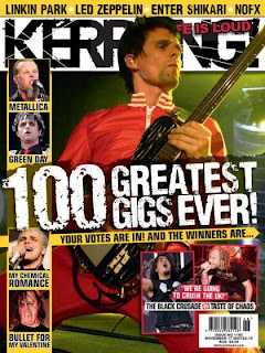
There are several things that both these magazines do on their front cover.
1. big picture, taking up most of the front page, 2. information down the left side of the page, things that are in this magazine. 3. Main story on top of the picture, big and bold. usually about the picture. 4. follows a colour scheme 5. bar code in the bottem right corner 6. main picture is infront of mast head. These are a few ideas that i can put into my front cover to make it look professional. There is also things that they do differently to make them unique. Instead of words, the kerrang magazine mainly uses pictures, down tthe side thee are pictures telling you what is in the magazine instead of writing. The writing on the kerrang magazine is a lot bigger. The NME magazine has smaller and a lot more writing.
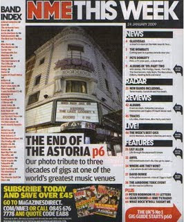
These two contents pages include several conventional contents page ideas. Both have the title of the magazine at the top with the date. Both have a main image, then maybe one or two other images ( could be another page number or advert) both have the page number at the left but there are a lot more differences in the contents than the front cover. NME contents has a band index, advert, distinct grouping ( news, radar, reviews etc) where as the Q contents is simpler with two catagories 'features' and 'every month' but also has a 'reviews' section. Although both are very plain, not much colour, the Q contents does use more colour in the picture and text.
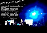
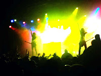
Both double page spreads have a big picture taking up most of the page. They also have big titles, small writing. Because the pictures take up so much room, there isn't very much writing. The right double page spread has a big picture and other small pictures, on the left double page spread there is only one picture (not including the pictures of faces in the bottem left) Both pictures are of bands on stage. In my magazine i can use some of these ideas, to make mine look professional i will need to have a big picture taking up most of the pages, small writing, less writing to picture ratio, big heading. But there are some ideas that are optional like, more than one picture, band reviews, fans input etc. As for the acctual input, the text is informal and apealing to the younger audience.
Deisgn
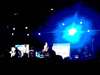
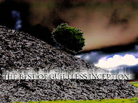
FIRST TRY
